Docs / Design
Design principles
The six principles behind the PeterOS interface.
- Monochrome interface, distinctive Peter mark. Hierarchy comes from contrast, weight and space; only the Peter orb keeps its iridescent colors.
- Chat is the home screen. Everything starts from the composer: type, talk, or /command.
- Calm. No ads, no attention-seeking badges, nothing that auto-plays.
- Private by design. Every screen that touches the mic, internet or messages says so plainly.
- Apple-level polish, Android behaviour. Clean type and spacing; lock screen, notifications and back gesture behave like Android.
- One assistant model. Peter uses one fixed on-device language model, labelled “PeterOS model”. There is no model picker, tier, or switching setting.
#Concept artwork
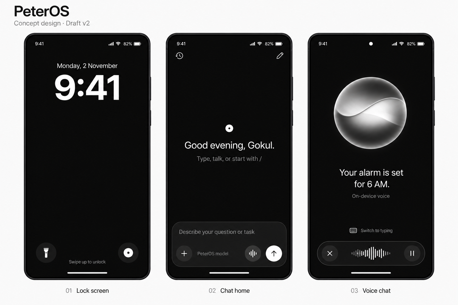
Draft v2 concept artwork, not screenshots of working software. It predates the current Peter orb logo.